ABOUT THE PROJECT
The goal of this project was to go through the UX and UI design process for Elden Ring and create a case study, going through all parts of the process, from wireframing all the way to some hi-fi design examples.
Roles / Responsibilities
I was tasked with recreating and designing a version of some screens from Elden Ring. This included creating a player journey, flow charts, wireframes and mock-ups.
TOOLs
Figma was used for:
- Player Journey
- Paper Protoype
- Flowcharts
- Wireframes
Adobe Photoshop was used for:
- Hi-Fi Mockup
- UI Style Guide
Timeline
3 AUG 2023 – 21 SEPT 2023
Player Experience
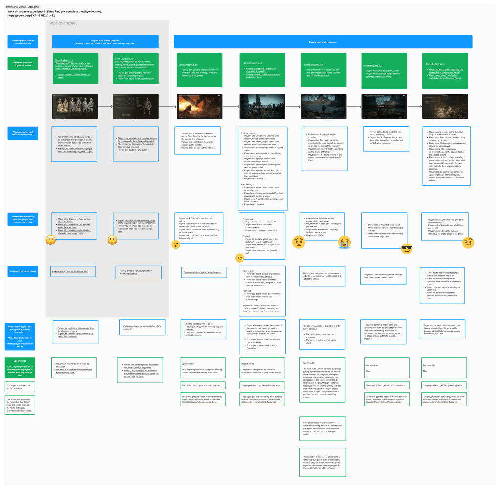
For the first step, I had to think about the player experience in terms of how the game was designed, answering several questions about each stage and approximating the feeling that is intended to be evoked to the player on each screen (represented by emojis here).
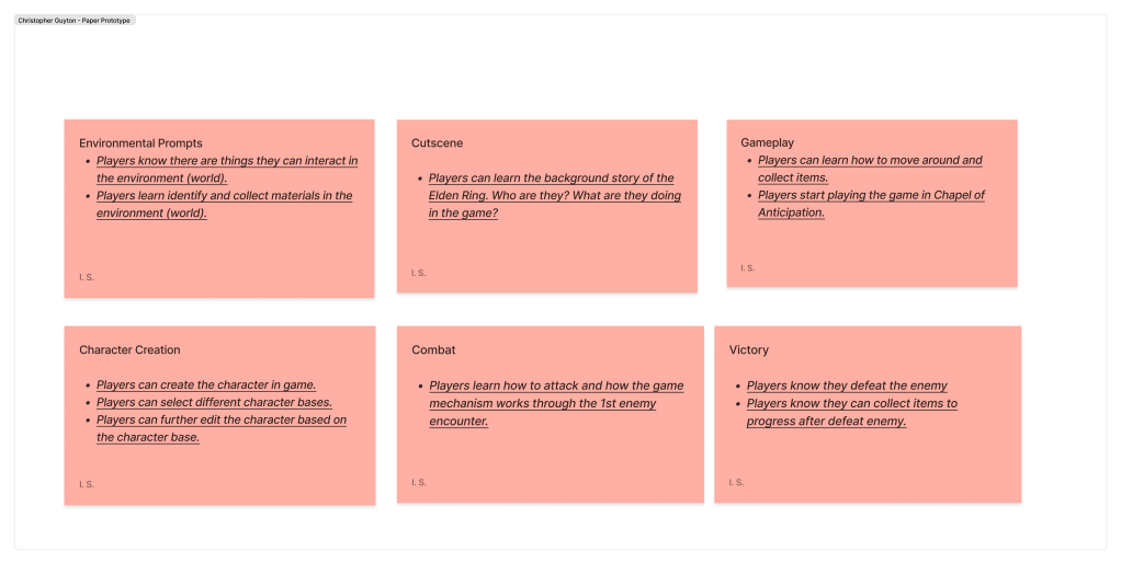
Paper Prototype
Next, I created a paper prototype and flowcharts for each screen and it’s options.
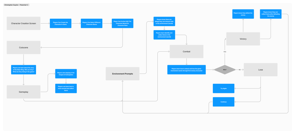
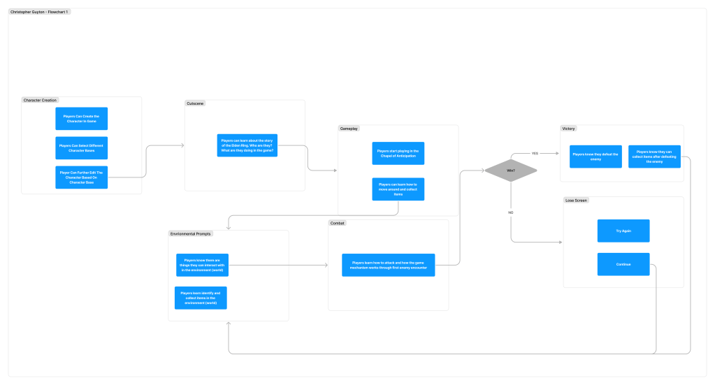
User Flowcharts
After creating the paper prototype, I moved on to user flowcharts. For this project, I created two different versions of the user flowcharts, each with a slightly different methodology for grouping the screens and their options.
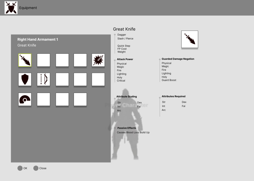
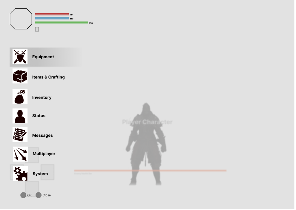
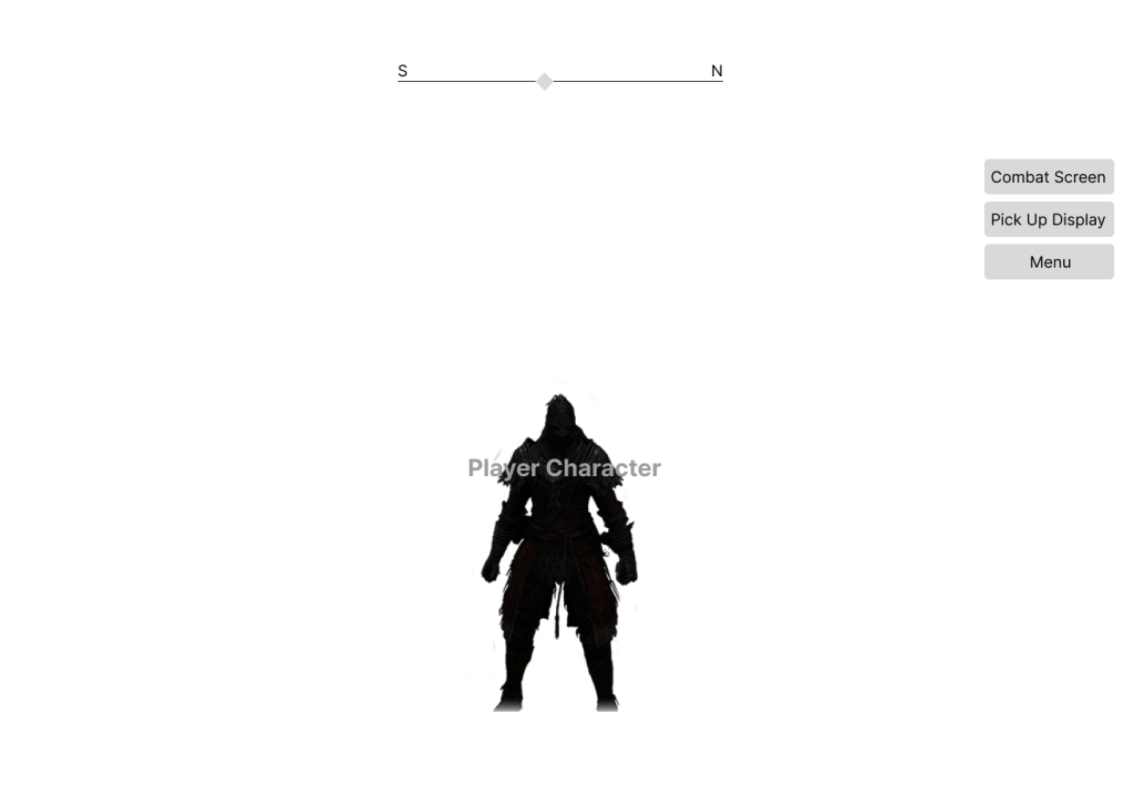
Initial wireframes
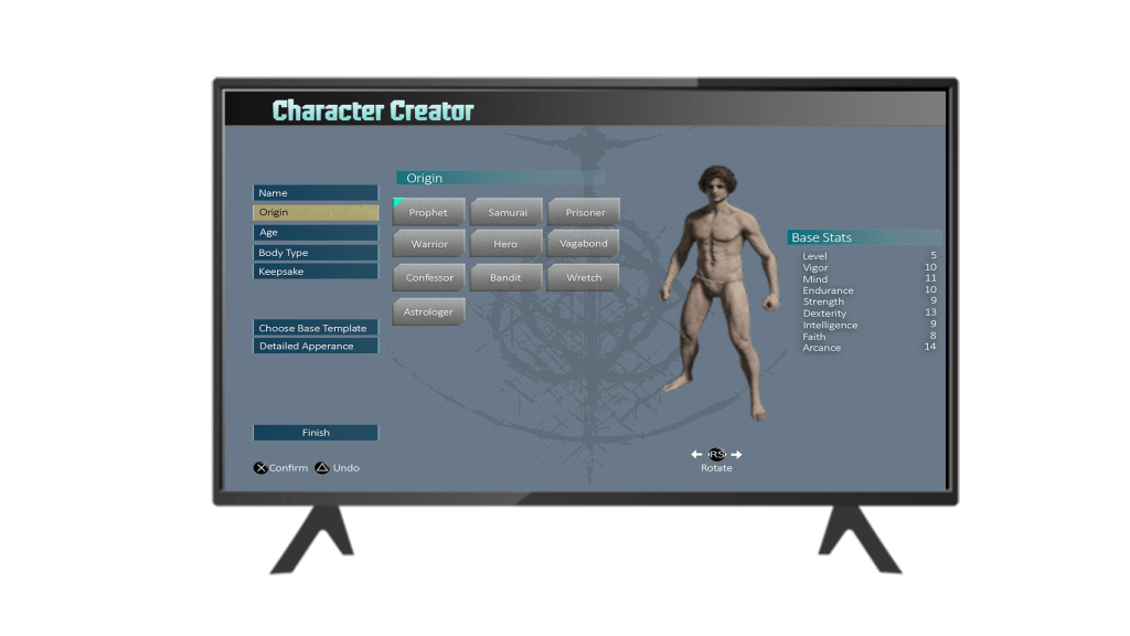
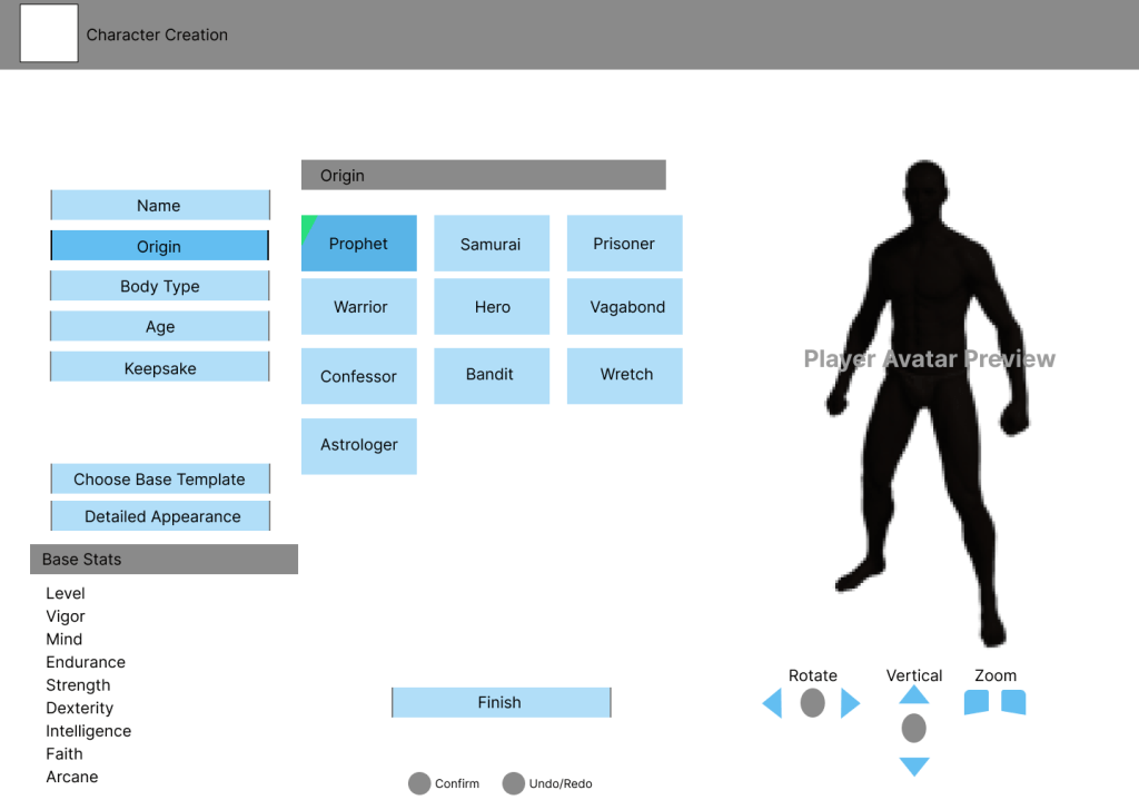
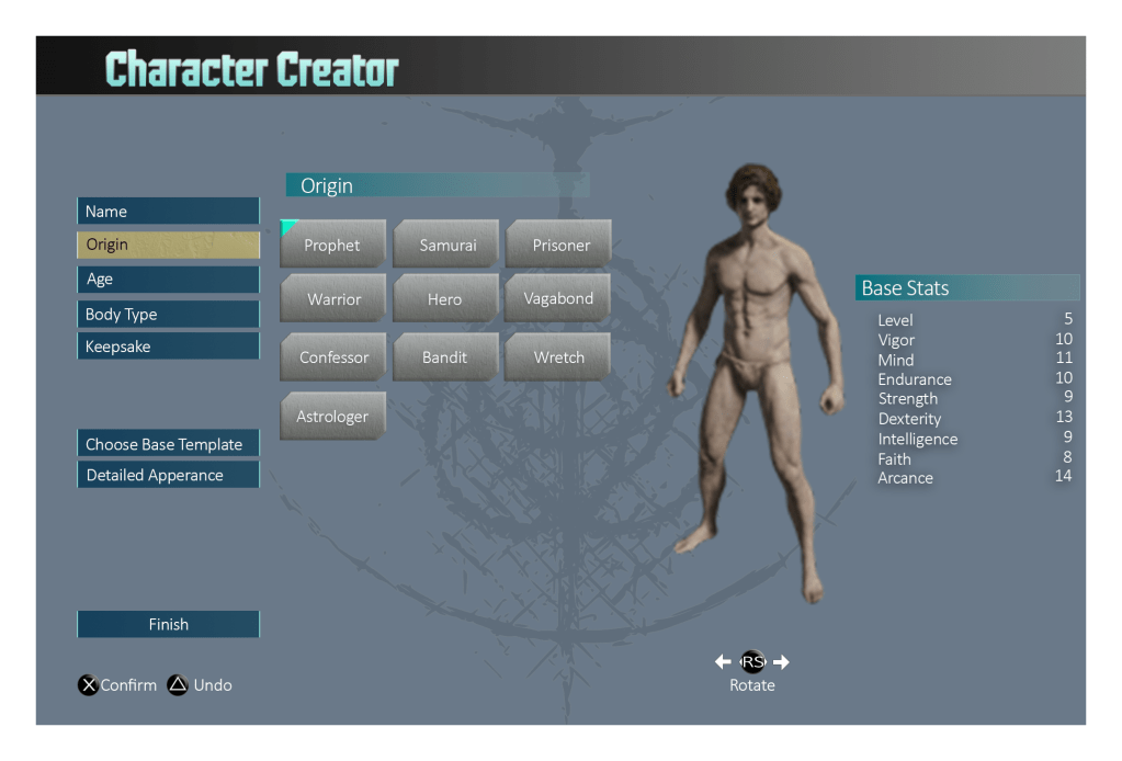
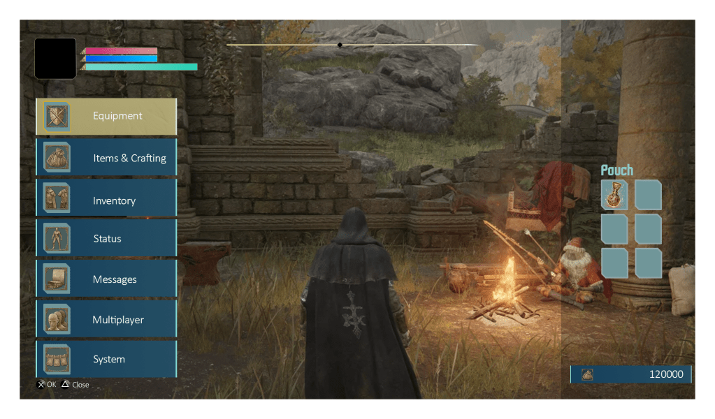
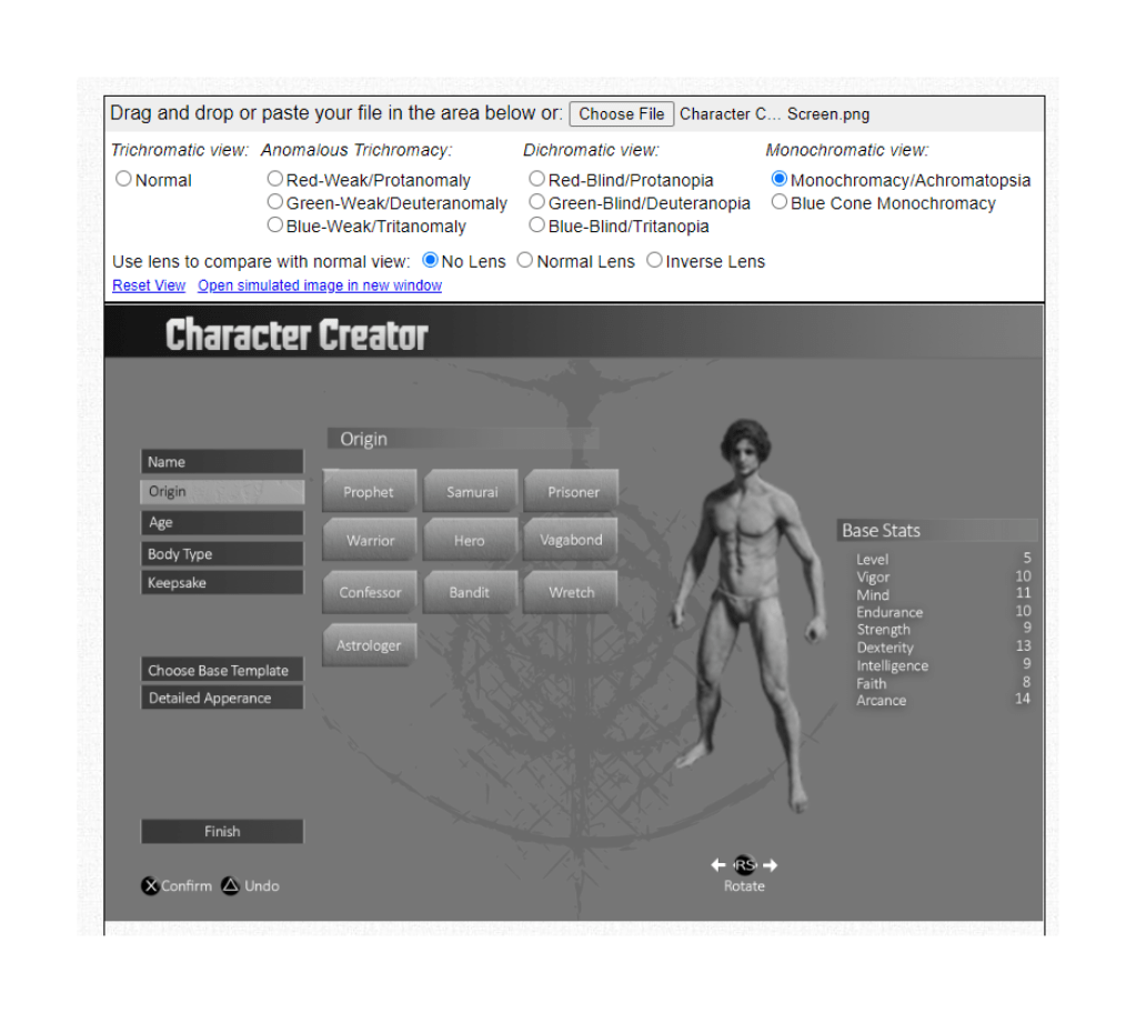
For this project I had a few options. I was instructed to either attempt to create the designs using elements from the game itself, or re-design it using another games design as inspiration. Since Elden Ring has a character creator and I had been playing a lot of Street Fighter 6 at the time, I thought it might be interesting to re-design the character creator screen to look more like the one in Street Fighter 6.
In addition, I created a few wireframes from other screens in the game, primarily to get more practice using Figma to create wireframes. The first three images here are those, and the large image is my interpretation of the Character Creator from Elden Ring re-designed in the style of the character creator from Street Fighter 6.
USABILITY TESTING
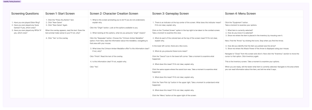
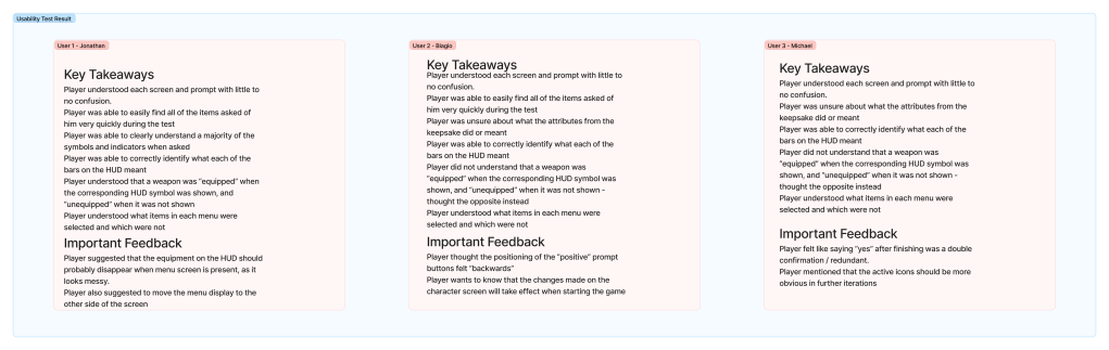
I conducted 3 usability tests using Figma’s prototyping tools. The test involved having each user share their screen and asking them to perform tasks and answer questions about the user interface screens. I then logged the results and use them as guides for how to revise the UI.
HI-FI MOCKUP
For the Hi-Fi mock ups, I leaned more heavily into using Street Fighter 6’s color palette for the character creator. I took the initial mock ups, imported them into photoshop, and created these mock-ups in that style within photoshop.
With a bit of feedback from the instructor, I came up with this final iteration that used inspiration from SF6.
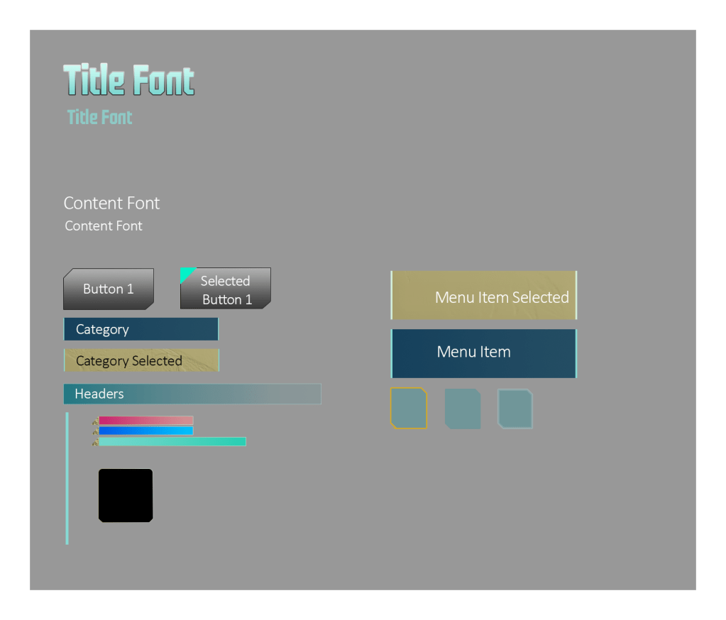
UI Style guide
As an additional and optional part of the assignment, I created a UI style guide which contained font types, button styles, and other UI elements.
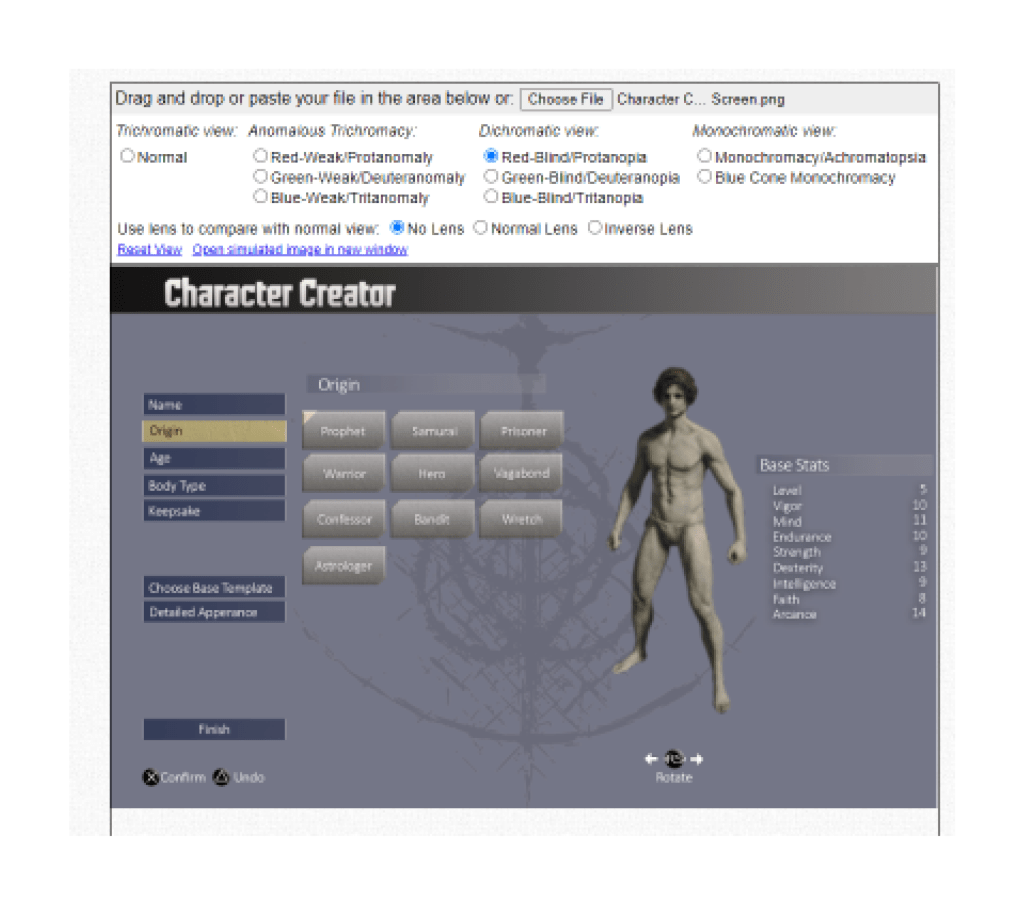
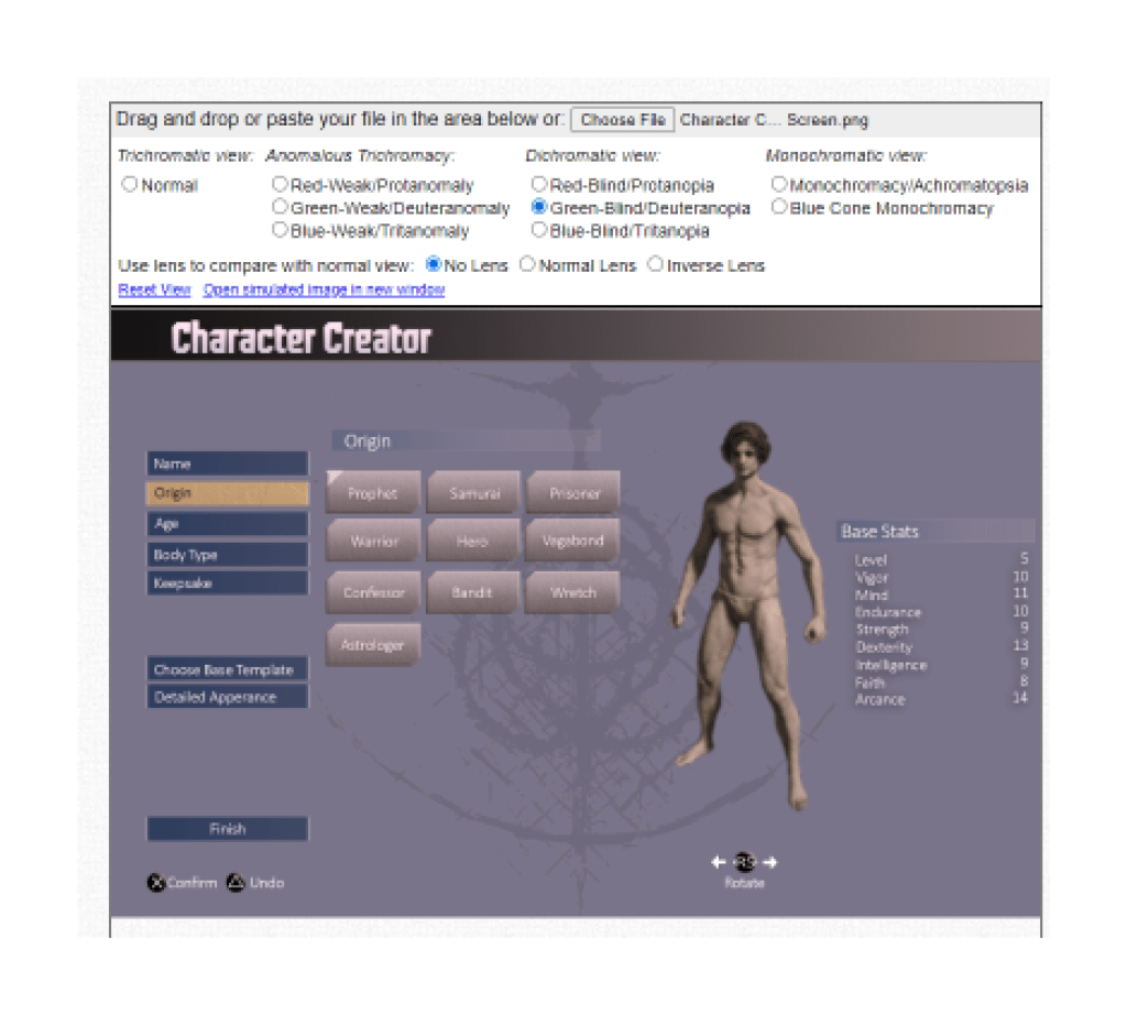
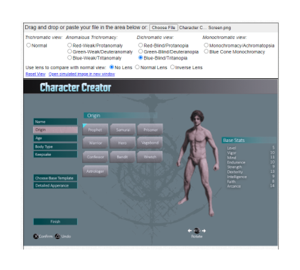
Color BLINDness Checks
Accessibility is an important part of UI Design, and for this project, I went ahead and used Colbis to check this design in their colorblindness checker tool. Luckily, since the colors I used were lifted directly from SF6, most of that leg-work was done for me, but I have a few examples of how this screen looks at different levels of colorblindness.
Conclusion
I successfully went through all of the steps of the UX/UI design project, and I have a re-designed character creation screen to show for it!
