Galaxy Shooter 2D
Galaxy Shooter 2D is a 2D top down arcade style shooting game created by Jonathan Fagan.
My role on this project was UI Designer, primarily working on the player HUD. I also did some light programming as well.
In Collaboration with Jonathan Fagan
Project Duration:
3 days
Role:
UI Designer
Original HUD Problems
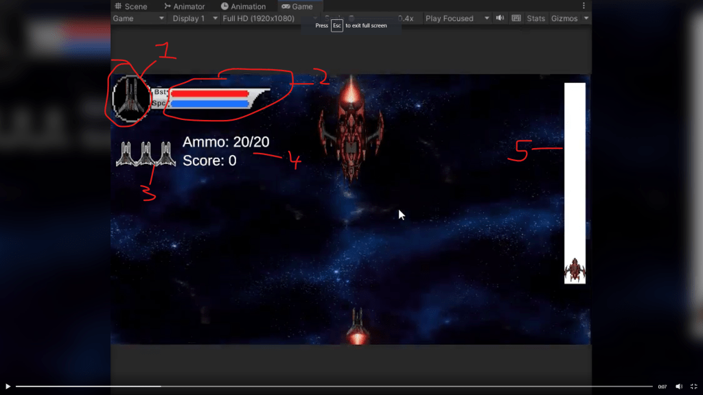
- The player icon was a bit redundant, considering that the same icon was used for lives (number 3). I thought there was no need to show that.
- The HUD overlay wasn’t very well explained, and the acronyms weren’t very informative. In general, I like to have as little text as possible in a HUD, and display information with symbols rather than words. In addition, the colors chosen were confusing (red is not a great color for a thruster boost as it can be easily confused for health).
- The lives as mentioned in number 1, were a bit confusing in this area considering the overlay at top.
- Too much text! Ammo could be changed to a symbol, and score might need a text indicator but it was too prominent and the same size and space as ammo, when it’s less important information.
- The bosses health bar is white, which is not great color language!
Approach
The first thing I did was to create a quick mock up of my design and share it with the game designer. I used Adobe XD for the mock up and made it very quickly so that I could get feedback and iterate if necessary. The intention was to get as close as possible to the way the UI would look in game, so I took a screenshot and overlayed my rough design on top of it with explanations.

- Moving the “lives” (and the whole HUD) to the bottom of the screen, and getting rid of the overlay so as to not have redundant images on screen that confuse the player.
- Removing the unnecssary text for the thrusters and the laser beam, and swapping out their order and color for better color language.
- Replacing the “Ammo” text with an icon that will show what ammo is being used.
- Replacing the text for the booster and laser with icons opposite of the ammo, to show they are different things.
- Moving the score text to the right side of the screen and making it a bit smaller
Once this design was approved by the game designer, I got to work creating the in game icons.
Creating the Icons
The game designer was ok with having a pixel art look for the icons, so I made these icons for the UI in Aseprite.

- Default ammo icon
- Laser Beam Icon
- Thruster Icon
- Not Pictured: Triple shot icon (replaces the default ammo when triple shot power up is picked up during gameplay).
UI Programming
Once the icons and general design were implemented in game, I went a head and did some light programming to ensure that when the player collects the triple shot power up, the icon changes on the UI to reflect this, as well as doing some programming to ensure that when the player collects a shield power up, that the lives icons change color to reflect the state of the shield as well.
FONT UPGRADE
The last thing I had to do was replace the default font. I had a few action fonts that I had previously downloaded in a pack, so all that I needed to do was convert them to be used with rich text blocks, and voila! We had a transformed HUD!

